
Migros Online
Helping Migros customers to effortlessly find product information for groceries.
Migros Online
Helping Migros customers to effortlessly find product information for groceries.
Migros Online
Helping Migros customers to effortlessly find product information for groceries.
Context
Client
Migros Online, Switzerland's leading online supermarket
Client
Migros Online, Switzerland's leading online supermarket
Client
Migros Online, Switzerland's leading online supermarket
Role
Research, information architecture, prototyping, user testing, UX, UI
Role
Research, information architecture, prototyping, user testing, UX, UI
Role
Research, information architecture, prototyping, user testing, UX, UI
Duration
12 weeks (2021)
Duration
12 weeks (2021)
Duration
12 weeks (2021)
Team
1 product manager, 8 engineers, 1 data analyst, 1 UX researcher, 1 UX/UI designer (myself)
Team
1 product manager, 8 engineers, 1 data analyst, 1 UX researcher, 1 UX/UI designer (myself)
Team
1 product manager, 8 engineers, 1 data analyst, 1 UX researcher, 1 UX/UI designer (myself)
Brief
My team's mission was to enable our customers to discover our products and find all the relevant information at the right time, to complete their grocery shopping successfully and efficiently.
With over 4 million visits per month, the product detail page is one of our most frequently used features. One of our key initiatives was to completely redesign it. Our primary goal was to address the numerous pain points our customers were experiencing, while also establishing the foundations for integrating new features and information in the future.

The old product detail page before it was rebranded and redesigned.
Brief
My team's mission was to enable our customers to discover our products and find all the relevant information at the right time, to complete their grocery shopping successfully and efficiently.
With over 4 million visits per month, the product detail page is one of our most frequently used features. One of our key initiatives was to completely redesign it. Our primary goal was to address the numerous pain points our customers were experiencing, while also establishing the foundations for integrating new features and information in the future.
The old product detail page before it was rebranded and redesigned.
Solution
Full-page design
To make better use of the space and decrease the information density, we switched from a modal to a full-page design. Not only did this allow us to display more product information (whether due to customer needs or legal requirements), it also had a significant positive impact on SEO.

The most important attributes at a glance
Most of our research efforts went into restructuring the product information based on relevance and coherence. Tabs on desktop and accordions on mobile have proven to be the most intuitive and efficient ways to find information.
Easy comparison with alternatives
Despite poor usability, the product slider was intensively used on the old product detail page. We incorporated additional product information and the «add to cart» functionality, allowing our users to efficiently compare similar products and find their best match. Throughout this process, we conducted an A/B/C test to evaluate different recommendation models.
Solution
Full-page design
To make better use of the space and decrease the information density, we switched from a modal to a full-page design. Not only did this allow us to display more product information (whether due to customer needs or legal requirements), it also had a significant positive impact on SEO.
The most important attributes at a glance
Most of our research efforts went into restructuring the product information based on relevance and coherence. Tabs on desktop and accordions on mobile have proven to be the most intuitive and efficient ways to find information.
Easy comparison with alternatives
Despite poor usability, the product slider was intensively used on the old product detail page. We incorporated additional product information and the «add to cart» functionality, allowing our users to efficiently compare similar products and find their best match. Throughout this process, we conducted an A/B/C test to evaluate different recommendation models.
Results
By redesigning the product detail page, we managed to increase the «add to cart» conversion rate by 5.7%, without introducing any new features. This corresponds to an additional revenue of 3.5 million Swiss Francs per year. We observed the biggest improvement among desktop users, where the conversion rate increased by 10%.
At the same time, we laid the groundwork for further improvements. One of these was the introduction of a product slider at the end of the product detail page to inspire our customers. This addition generated an extra revenue of 1 million Swiss Francs per year.
Process
1. Research
In our previous research, we had already identified several customer pain points:
The layout of the product detail page came with a high information density, which caused cognitive overload.
Prices and discounts were communicated in a confusing manner.
Call to actions were unclear, especially the «add to cart», making it difficult for customers to select the desired quantity.
Some product information was perceived as irrelevant, while important details like shelf life were missing.
To learn more about the relevance of different product information, I conducted a qualitative study together with a UX researcher in which we used the card sorting method. Simultaneously, I worked with a data analyst to better understand the usage of the old product detail page.
2. Exploration
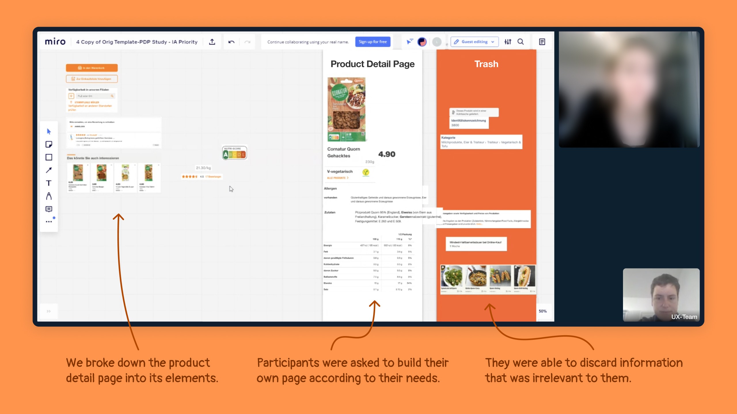
Once our research questions were answered, I teamed up with a frontend engineer for a two-week exploration phase. We broke down the product detail page into its components (such as product image and add to cart), explored each one separately, and then combined them into several concepts.

During this phase, I maintained close communication with the the team and stakeholders, including category management, to gather their needs, knowledge and ideas.

3. Usability testing
Next, we tested prototypes – two for desktop and two for mobile web. The goal was to validate the ease of finding product information, using different patterns for structuring it.

4. Handover
Based on our learnings from the usability test, I refined the designs and provided our engineers with user stories, visual designs, prototypes and documentation.

5. A/B test & rollout
Once the designs were implemented and reviewed, we launched an A/B test to measure our impact. Achieving a significant 5.7% increase in conversion rate, we didn't hesitate to gradually roll out the new product detail page to all customers.
Process
1. Research
In our previous research, we had already identified several customer pain points:
The layout of the product detail page came with a high information density, which caused cognitive overload.
Prices and discounts were communicated in a confusing manner.
Call to actions were unclear, especially the «add to cart», making it difficult for customers to select the desired quantity.
Some product information was perceived as irrelevant, while important details like shelf life were missing.
To learn more about the relevance of different product information, I conducted a qualitative study together with a UX researcher in which we used the card sorting method. Simultaneously, I worked with a data analyst to better understand the usage of the old product detail page.
2. Exploration
Once our research questions were answered, I teamed up with a frontend engineer for a two-week exploration phase. We broke down the product detail page into its components (such as product image and add to cart), explored each one separately, and then combined them into several concepts.
During this phase, I maintained close communication with the the team and stakeholders, including category management, to gather their needs, knowledge and ideas.
3. Usability testing
Next, we tested prototypes – two for desktop and two for mobile web. The goal was to validate the ease of finding product information, using different patterns for structuring it.
4. Handover
Based on our learnings from the usability test, I refined the designs and provided our engineers with user stories, visual designs, prototypes and documentation.
5. A/B test & rollout
Once the designs were implemented and reviewed, we launched an A/B test to measure our impact. Achieving a significant 5.7% increase in conversion rate, we didn't hesitate to gradually roll out the new product detail page to all customers.
More information
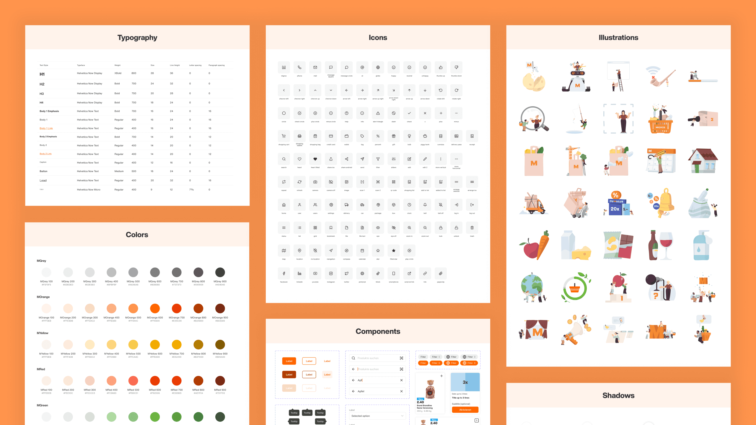
The redesign of the product detail page was just one of many projects I tackled at Migros Online. Enabling our customers to discover new products, save money or take environmentally friendly purchasing decisions were some of the topics I was invested in. Additionally, I played a key role in optimising collaboration processes and establishing a design system.
More information
The redesign of the product detail page was just one of many projects I tackled at Migros Online. Enabling our customers to discover new products, save money or take environmentally friendly purchasing decisions were some of the topics I was invested in. Additionally, I played a key role in optimising collaboration processes and establishing a design system.